
How to Mix Prints Successfully Without Looking Busy: A Practical Guide
Learn how to mix prints successfully without looking busy. Our guide covers scale, color, and proportion so you can wear patterns with confidence.
Mixing prints can feel like a high-risk styling move. One wrong combination and you go from effortlessly chic to costume-party chaos. But learning **how to mix prints successfully without looking busy** is one of the most useful skills you can add to your wardrobe toolkit. When done right, printed outfits look intentional, polished, and way more interesting than a plain top and jeans. I’ve styled clients from Charlotte to New York, and the same principles work every time. Here’s how to make print mixing work in real life — without the visual clutter.
Start With a Neutral Anchor
The easiest way to avoid a busy look is to ground your outfit with at least one neutral piece. Think a solid camel blazer, white jeans, black trousers, or a denim jacket. This gives the eye a place to rest. For example, pair a leopard-print blouse with cream wide-leg pants and a tan belt. The neutral bottom keeps the print from overwhelming your frame. I often tell clients: if every piece is loud, nothing stands out. Choose one printed hero item, then build around it with solids or subtle textures.
Stick to One Scale
Print mixing goes wrong when patterns compete for attention. The trick is to vary the scale — pair a large floral with a tiny polka dot, or a wide stripe with a small check. But if both prints are medium-sized and equally bold, the outfit starts to vibrate. Start with one dominant print (like a big abstract bloom) and one supporting print (like a micro stripe). A good formula: large-scale print on top, small-scale on bottom, or vice versa. This creates hierarchy, not noise. I love a striped tee under a large-plaid blazer — the stripe is narrow enough to complement, not clash.
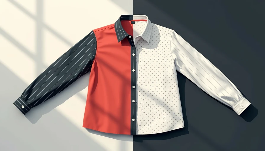
Use Color to Tie Them Together
Shared colors are the secret sauce. When two prints share at least one common hue, they automatically look cohesive. For instance, a navy-and-white striped shirt pairs perfectly with a floral skirt that has navy in the background. You don’t need matching colors — just a repeating tone. Pull one color from the print and echo it in the other. This is why animal prints (neutrals with black or brown) are so easy to mix: they already fit into any palette. If you’re nervous, start with monochromatic prints — all shades of blue, for example. The result is layered but calm.
The 70/30 Rule for Prints
To keep your outfit from feeling overdone, apply the 70/30 ratio. Seventy percent of your visual weight is a single, larger print (or a solid), and thirty percent is a smaller, contrasting pattern. This prevents the eye from bouncing around. A practical example: wear a printed dress (the big statement) and add a printed scarf or print-trimmed shoes (the small accent). You get the fun of mixing without committing to a head-to-toe pattern party. The rule also applies to accessories — a zebra-print bag can be the thirty percent against a polka-dot skirt.
When in Doubt, Add a Solid Layer
Sometimes you just need a buffer. A solid cardigan, blazer, or trench worn open over a mixed-print outfit breaks up the patterns and adds a clean line. This is especially helpful if you’re wearing two large prints. I’ve styled clients in a floral blouse with plaid pants, then layered a black turtleneck underneath and a black blazer on top. The black pieces frame the prints and make the whole outfit feel deliberate. Another easy trick: wear a solid-color belt to visually separate your top and bottom. It creates a pause in the pattern conversation.
Practice With Low-Stakes Combinations
Before you wear a mixed-print look out, test it at home. Lay out two printed pieces together and step back. If you squint, does the combination feel harmonious or chaotic? Squinting blurs details and shows you the overall color and value balance. You can also photograph the outfit in natural light — the camera often reveals what your eyes miss. Start with easy pairs: stripes and florals, polka dots and plaid, animal print and geometric. These are classic combos that rarely fail. My go-to test outfit: a thin-striped Breton top with a floral midi skirt. It looks like you planned it, even if you threw it on in five minutes.
Common Print Mixing Mistakes (and How to Avoid Them)
Even with the right principles, it’s easy to slip into common pitfalls. Here are three frequent mistakes and how to fix them — so you can master **how to mix prints successfully without looking busy** in every outfit.
**Mistake #1: Too many competing colors.** If your outfit has three prints each with different color families, it will look chaotic. Fix it: choose one print to dominate and pull one color from it to repeat in another piece. Example: a multicolor floral shirt works best when you pick up the green in a scarf or bag.
**Mistake #2: Matching prints exactly.** Wearing the same print top and bottom (like a full polka-dot suit) can look like a costume. Instead, vary the scale: pair a large polka-dot blouse with a small polka-dot skirt. The difference creates interest.
**Mistake #3: Ignoring fabric texture.** Shiny and matte prints can clash even if colors match. Pair a silky printed blouse with a cotton printed pant to add tactile variety. If both are shiny, the look can feel overwhelming.
Keep these fixes in mind, and you’ll avoid the busy look every time.
The Takeaway
Mixing prints is not about being the boldest person in the room. It’s about creating visual interest while staying wearable. The key principles — neutral anchor, consistent scale, shared colors, and a solid layer — keep the look intentional. Once you understand **how to mix prints successfully without looking busy**, you’ll find yourself reaching for patterns more often. It’s a style shortcut that makes your wardrobe feel twice as big without buying a thing. And if you wouldn’t reach for that outfit twice, it probably wasn’t worth putting together.